
Setting Up Your Chat Widget
Customize your chat widget's appearance, behavior, texts, and languages before publishing it through Deploy & Share.
What Is the Widget?
The chat widget is the guest-facing entry point that appears on your website after you publish it through Deploy & Share. It can be customized to match your brand, guide visitors into the right type of conversation, and support multiple languages.
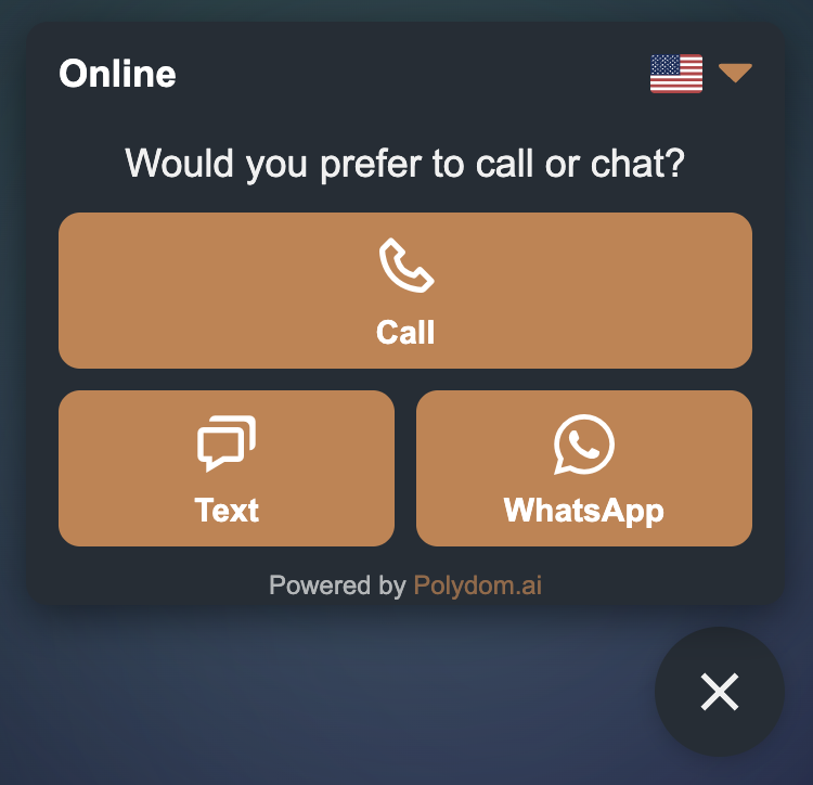
Depending on your configuration, guests can use the widget in three main ways:
Text chat — guests type messages and receive instant replies from Una
Voice call — guests start a browser-based voice conversation with Una
WhatsApp — guests open your connected WhatsApp flow and continue the conversation there
The exact options shown in the widget depend on the channels enabled for that agent and the action buttons you configured.
Widget Appearance
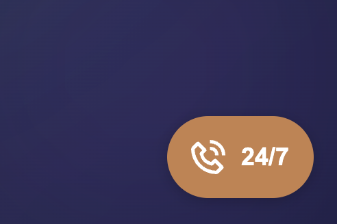
When the widget is minimized, guests usually see a compact launcher button in the corner of the page.
When a guest opens it, the widget expands and shows the communication options you made available, such as chat, call, or WhatsApp.
Accessing Widget Settings
Select your agent in the sidebar
Click Settings > Widget settings
Widget settings are organized into tabs such as General, Colors, Behavior, Languages, and Action Buttons.
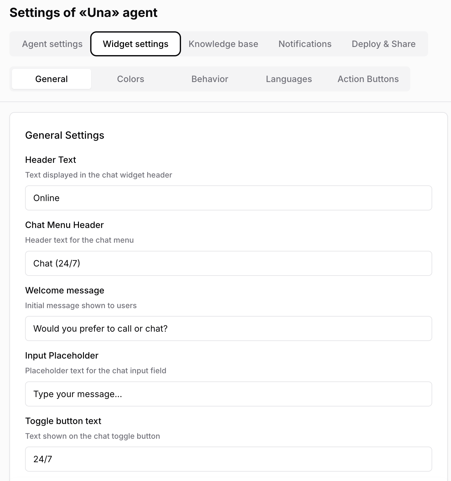
General Settings
Use the General tab to control the main texts guests see:
Header text — the title at the top of the chat window
Chat menu header — text shown in the menu area when the widget opens
Welcome message — the first greeting guests see
Input placeholder — hint text inside the message field
Toggle button text — text shown on the widget launcher button
Keep these texts short, clear, and aligned with your brand voice.
Colors
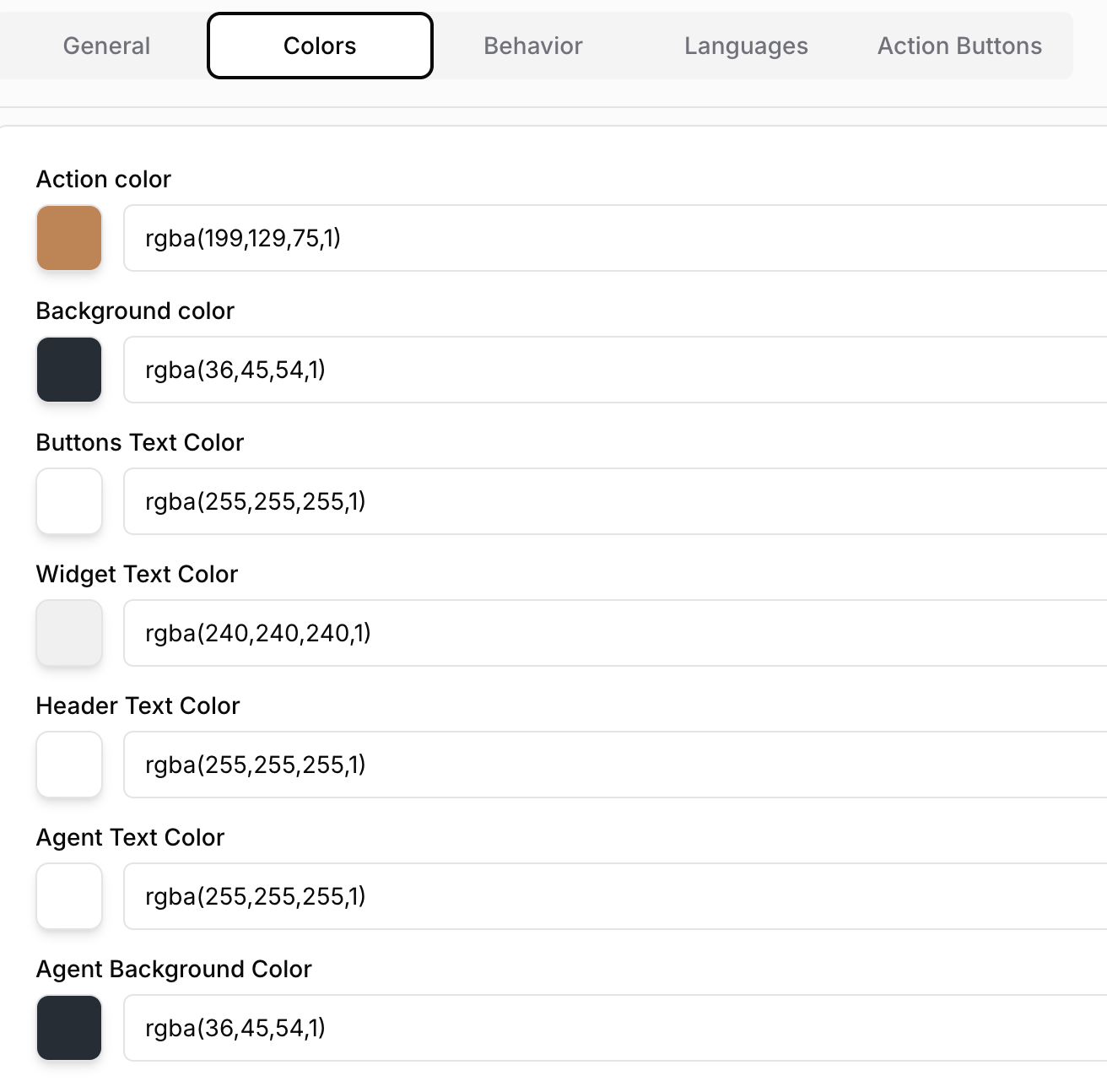
Match the widget to your brand by customizing colors:
Action color — buttons and primary accents
Background color — main widget background
Buttons text color — text shown inside buttons
Widget text color — general text in the widget
Header text color — text shown in the header area
Agent text color — text used in Una's messages
Agent background color — the background behind Una's message bubbles
Choose color combinations with good contrast so messages remain easy to read.
Behavior
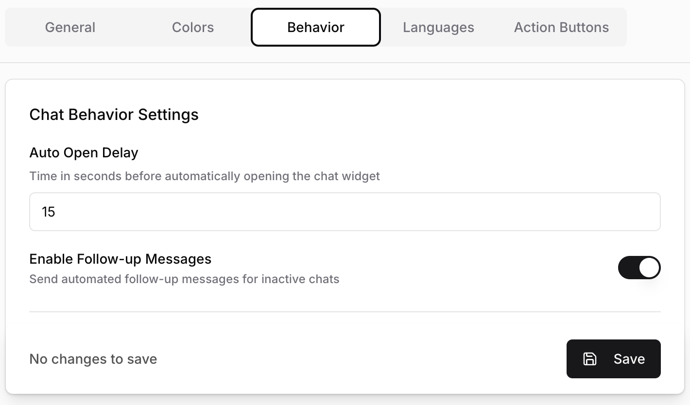
These settings control how the widget behaves after it loads:
Auto Open Delay — opens the widget automatically after a chosen number of seconds
Enable Follow-up Messages — turns follow-up messages on or off
Follow-up delay — defines how long Una waits before sending the follow-up
Follow-up text — the message shown to re-engage an inactive visitor
Show icon — controls whether the widget launcher icon is shown
Use auto-open and follow-up carefully. They can increase engagement, but aggressive timing may feel intrusive.
Voice Calls in the Widget
If voice is enabled for the selected agent, guests can start a live browser-based conversation with Una directly from the widget.
During voice interactions, Una can also support richer guest flows when available for your setup:
show a language prompt before the call starts
open an inline form so the guest can type details such as their name or email without ending the call
display supporting images or links while the conversation continues
This is especially useful for booking journeys, reservation follow-up, or situations where the guest needs both spoken guidance and something clickable on screen.
Messaging Tips
Two settings have a big effect on first impressions:
Welcome message — use this to explain what Una can help with
Suggested questions — add quick prompts that help guests start the conversation faster
Good suggested questions include:
"What are your check-in and check-out times?"
"Do you have parking?"
"What rooms are available this weekend?"
Languages
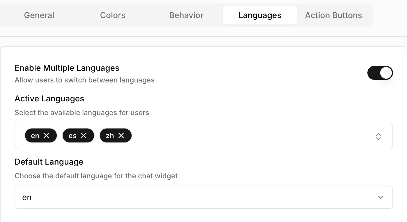
If your setup supports multiple languages, you can:
turn on Enable Multiple Languages
choose the Active Languages guests can use
set the Default Language shown first
When multi-language mode is enabled:
the widget interface can be shown in the supported languages
guests can switch the interface language from the selector in the widget
voice calls can begin with a language choice when more than one active language is available
Make sure the default language is also included in the active language list.
Action Buttons
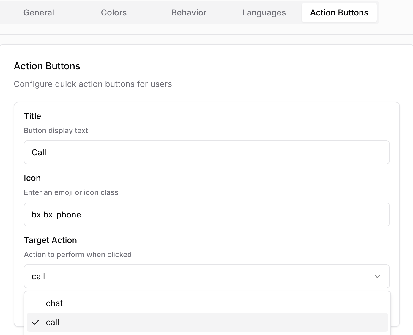
Action buttons let you add quick actions to the widget interface. Each button can include:
Title — the label shown to the guest
Icon — usually an emoji or icon
Target action — what happens when the button is clicked
Available targets can include:
Chat — start a text conversation
Call — start a voice interaction
Popup — open a follow-up interaction flow when supported
Use action buttons for common intents such as booking, calling, or asking a frequent question.
Saving Changes
Update the settings you need
Click Update
Wait for the success confirmation
What to Do Next
Once the design and texts look right, go to Deploy & Share to:
copy the embed code for your website
copy a direct widget link
download a QR code PDF for printed materials
Best Practices
Match colors to your brand, but prioritize readability
Keep text short and guest-facing
Add suggested questions only for common intents
Enable multiple languages only if your guest-facing content is ready for multilingual usage
Test the widget on desktop and mobile after every major change